

LOONEY TUNES
CLIENT: Warner Bros.
AGENCY: Movement Strategy
ROLE: Art Director
Brand Identity · Social-First Creative · Motion & Design


LOONEY CAMPAIGNS
-
![]()
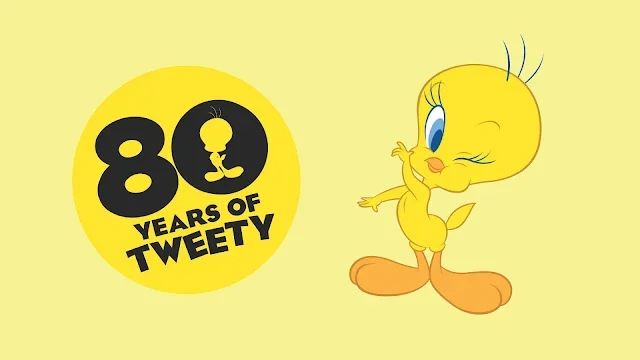
80 Years of Tweety
-
![]()
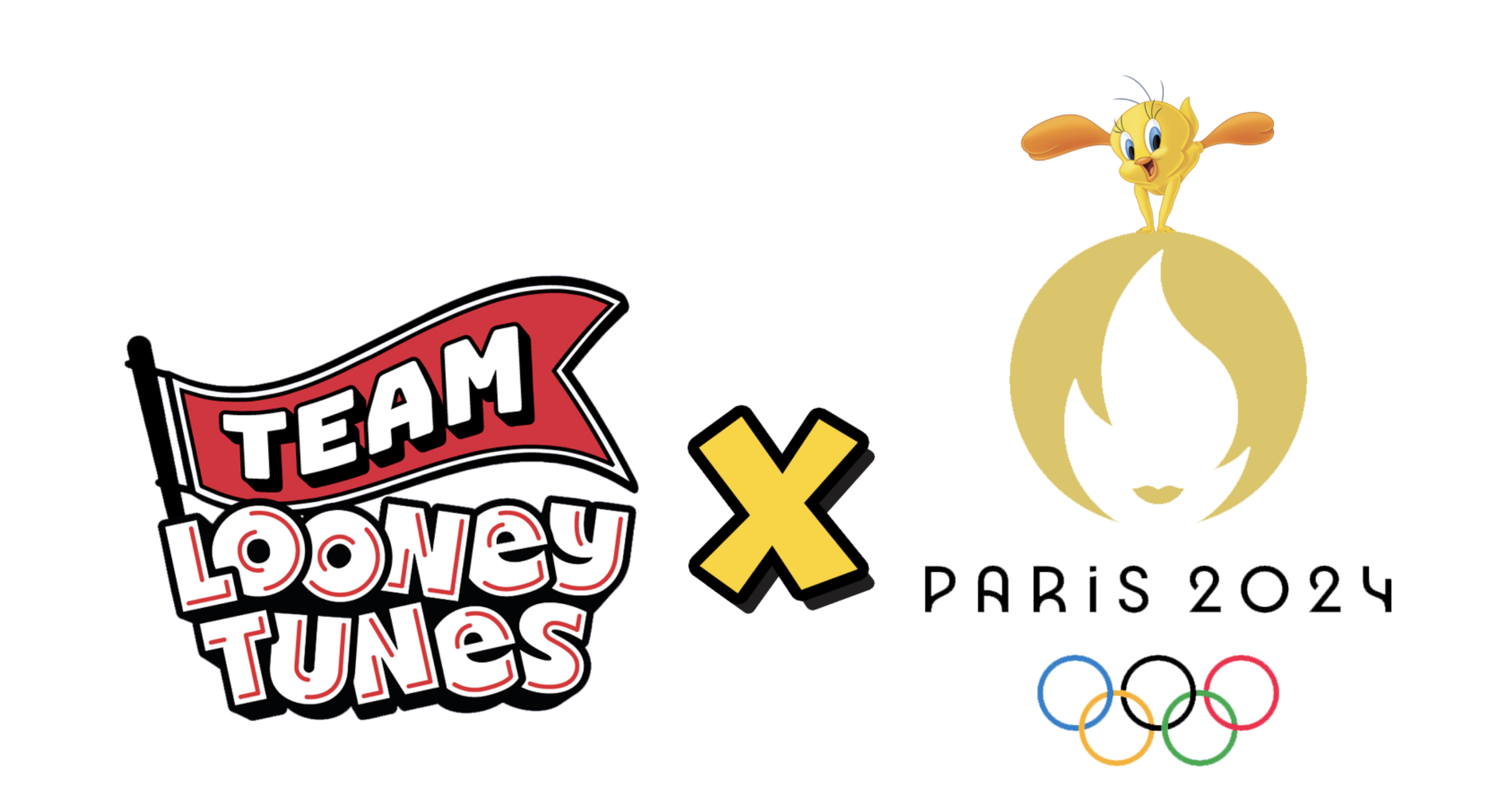
Team LT X Paris Olympics 2024
-
![]()
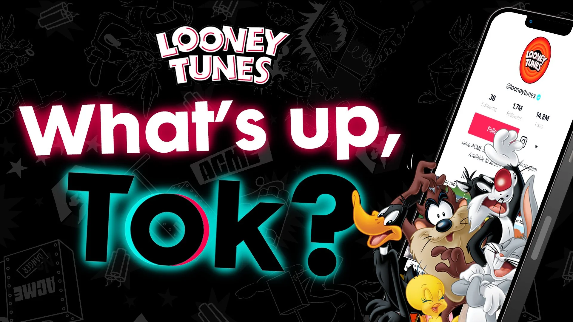
What's Up Tok? TIKTOK LAUNCH
-
![]()
ACME FOOLS (2023, 2024, 2025)

The CHALLENGE
Looney Tunes is one of the most recognized animation franchises in the worl, which is exactly what made it hard. Warner Bros. needed the brand to show up authentically on TikTok and Instagram for a Gen Z audience that has no nostalgic attachment to it, without alienating the fans who grew up with it. The risk wasn't obscurity. It was irrelevance.
STRATEGY
The brand had heritage. What it needed was a point of view. Rather than leaning on nostalgia or chasing trends reactively, we positioned Looney Tunes as a cultural commentator, a character-driven voice that could speak to whatever was happening in the world that week with wit and timing. The characters already had distinct personalities built over 80 years; our job was to translate those personalities into platform-native behavior, not just content formats.

THE SOLUTION
Over four years at Movement Strategy, I led the visual identity, creative system, and art direction for the brand's entire social presence. That meant building the toolkit from scratch — defining how each character showed up across memes, parody posters, original video, influencer collabs, and tentpole campaigns — and directing a team of designers, editors, and strategists across 30+ unique weekly deliverables. For the TikTok launch specifically, we developed a platform-native creative language that balanced the brand's classic visual DNA with the scrappier, more spontaneous register the platform demands. Campaigns like ACME Fools, the Paris Olympics collab, and What's Up Tok? each required their own creative approach while staying unmistakably Looney Tunes.
RESULTS
+1.1 MILLION
INSTAGRAM FOLLOWERS
+2.7 MILLION
TIKTOK FOLLOWERS
+14%
ENGAGEMENT RATE
AWARDS
-
Silver – Original Content: Creative Content
Silver – Social Media Campaign: Use of Influencer | Talent
Silver – Social Media Campaign: Organic Posts
-
Winner – Voice
Silver – TikTok Presence
Silver – Organic Promotion
-
Winner – Best Use of Video on Social Platforms.
Winner – Social Use of Single Platform -
Shortlist – Social Channel: Single Platform
Looney Tunes Social Launch Reel
LOONEY
ALL THE WAY
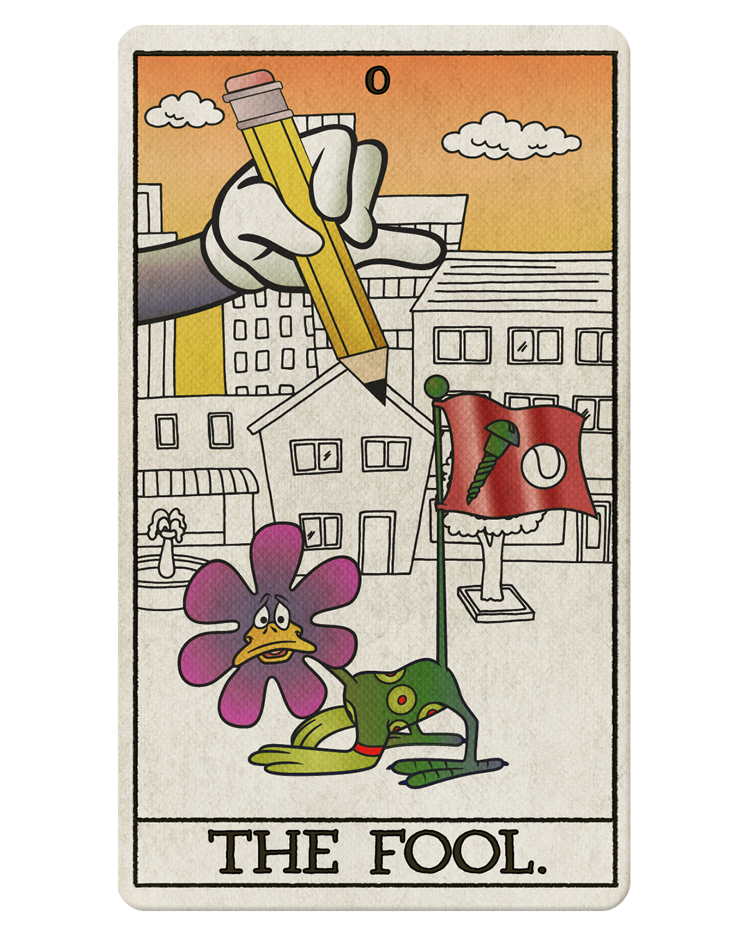
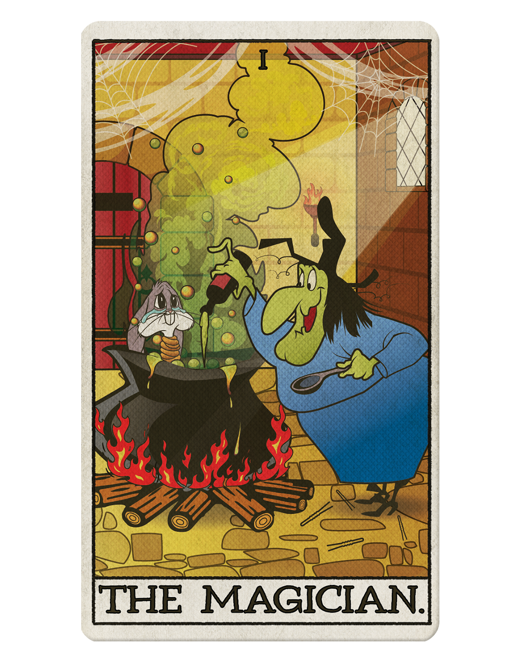
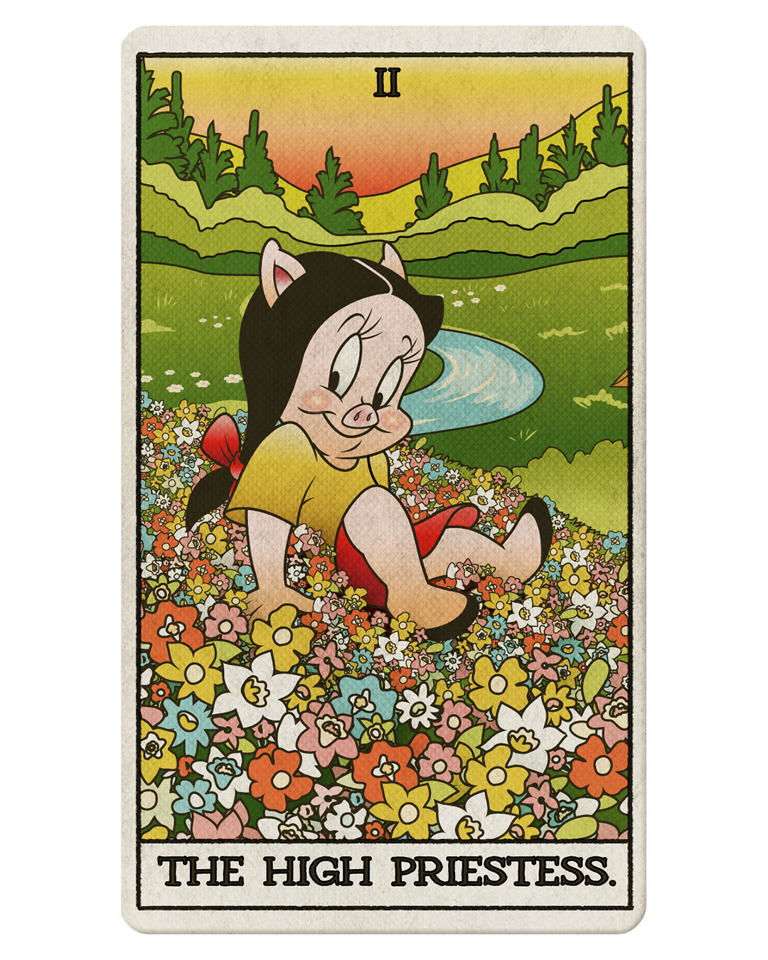
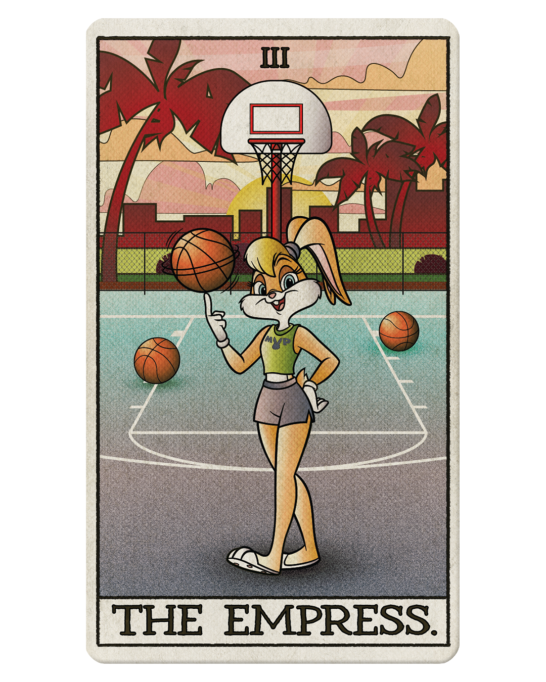
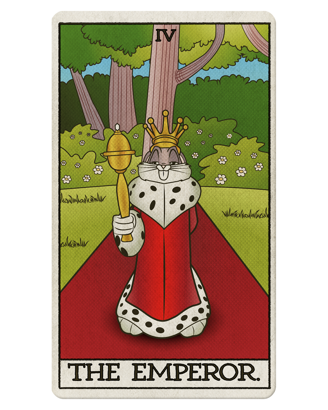
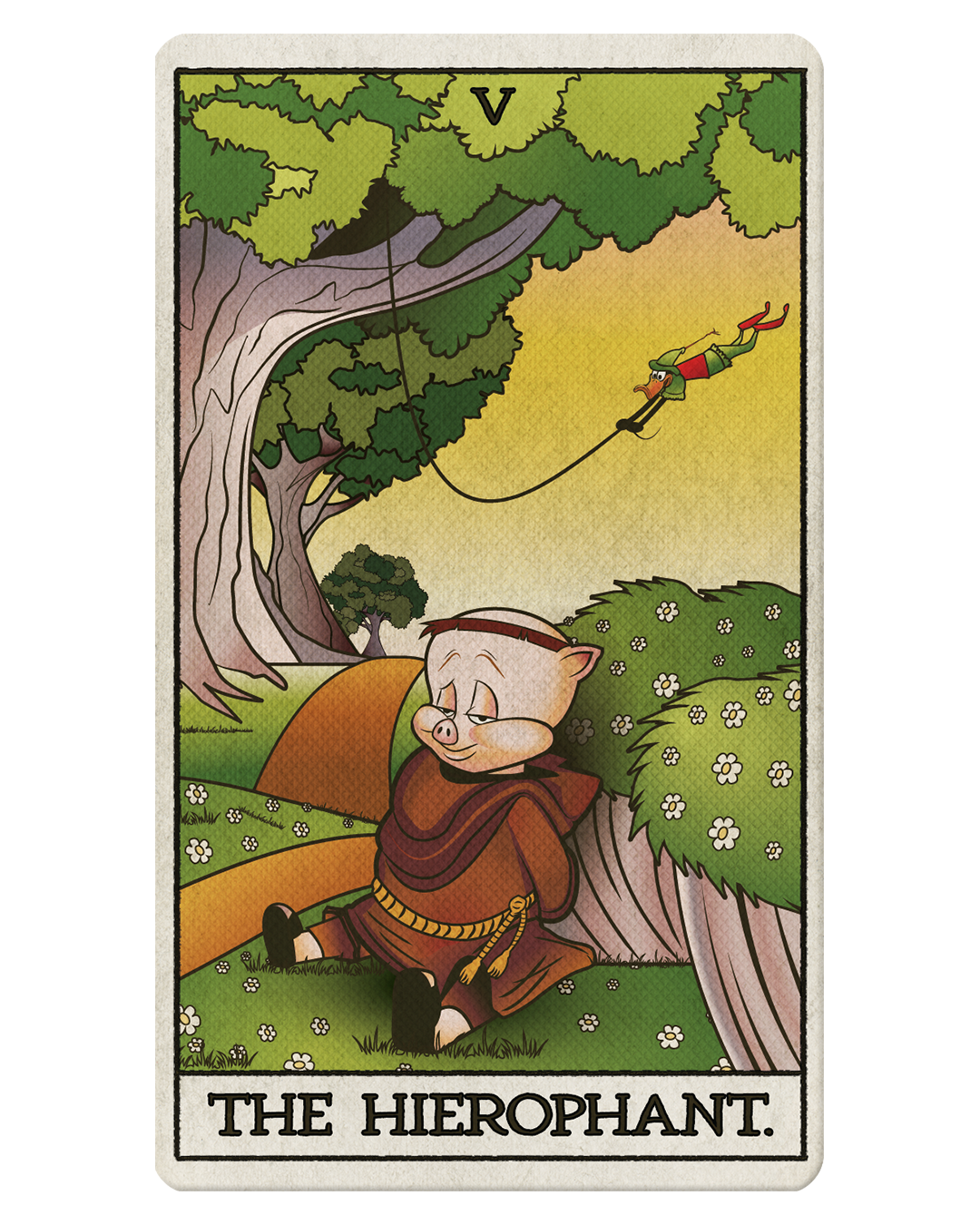
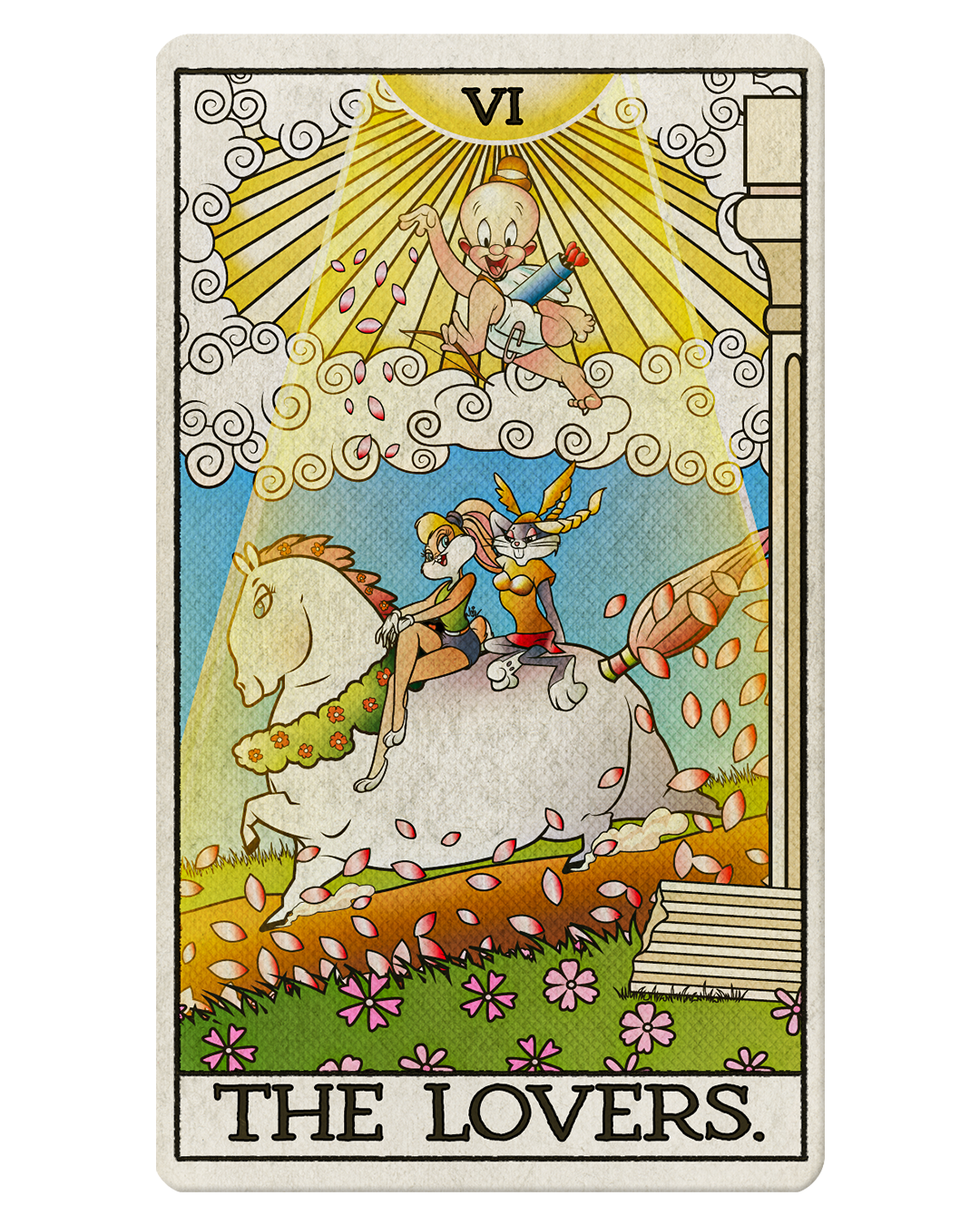
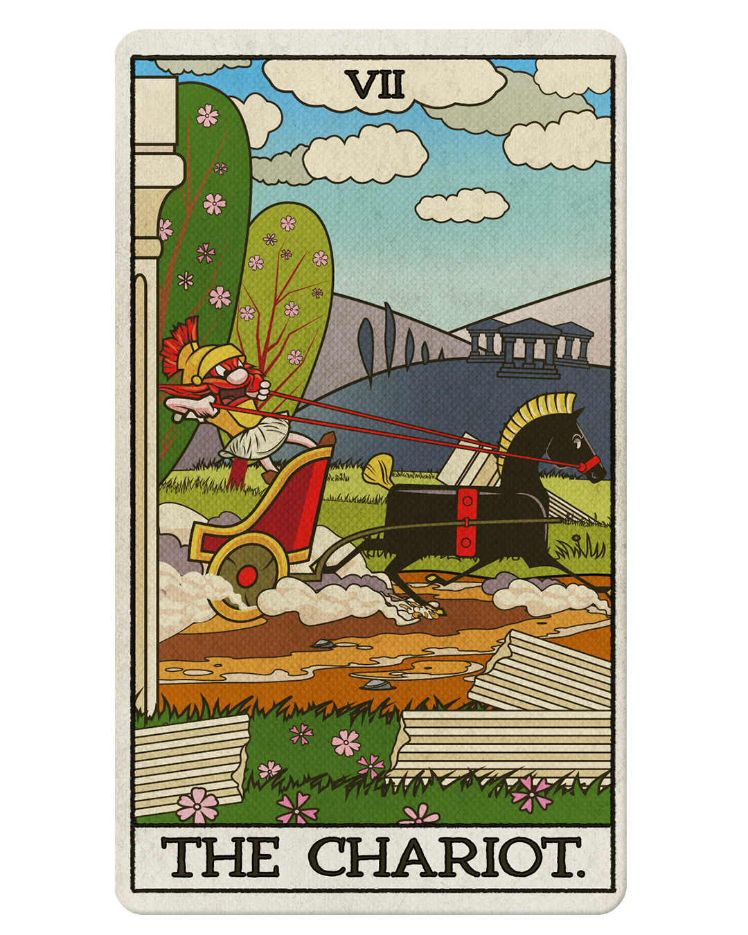
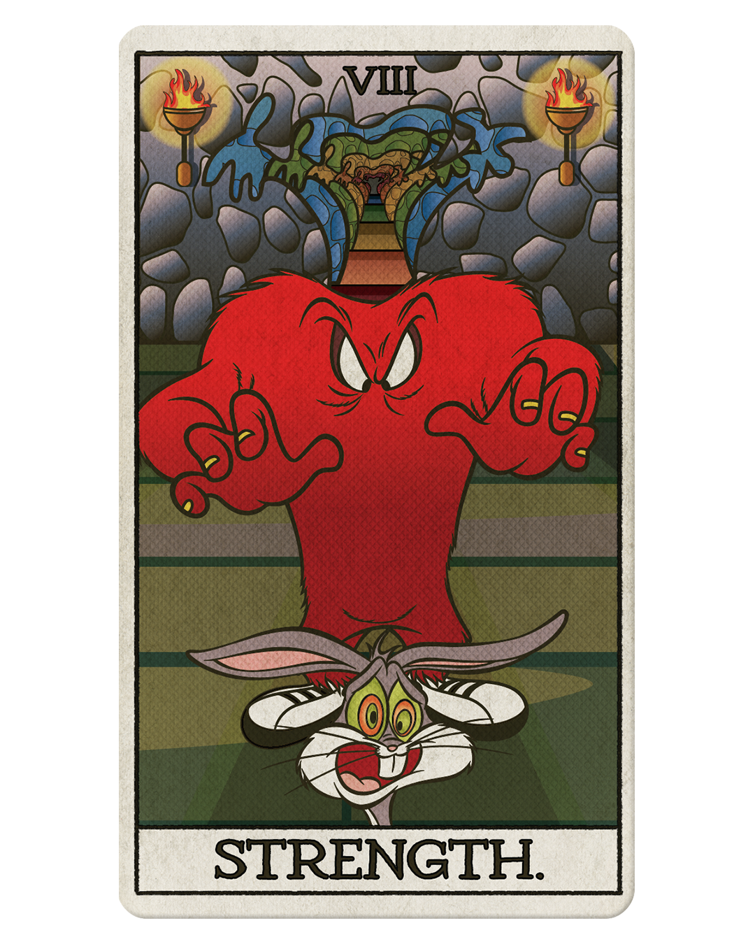
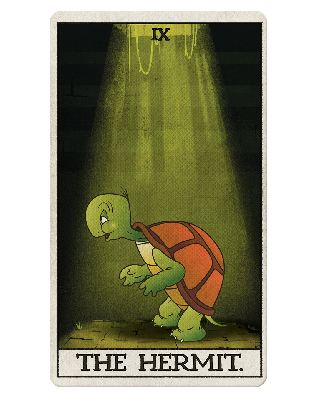
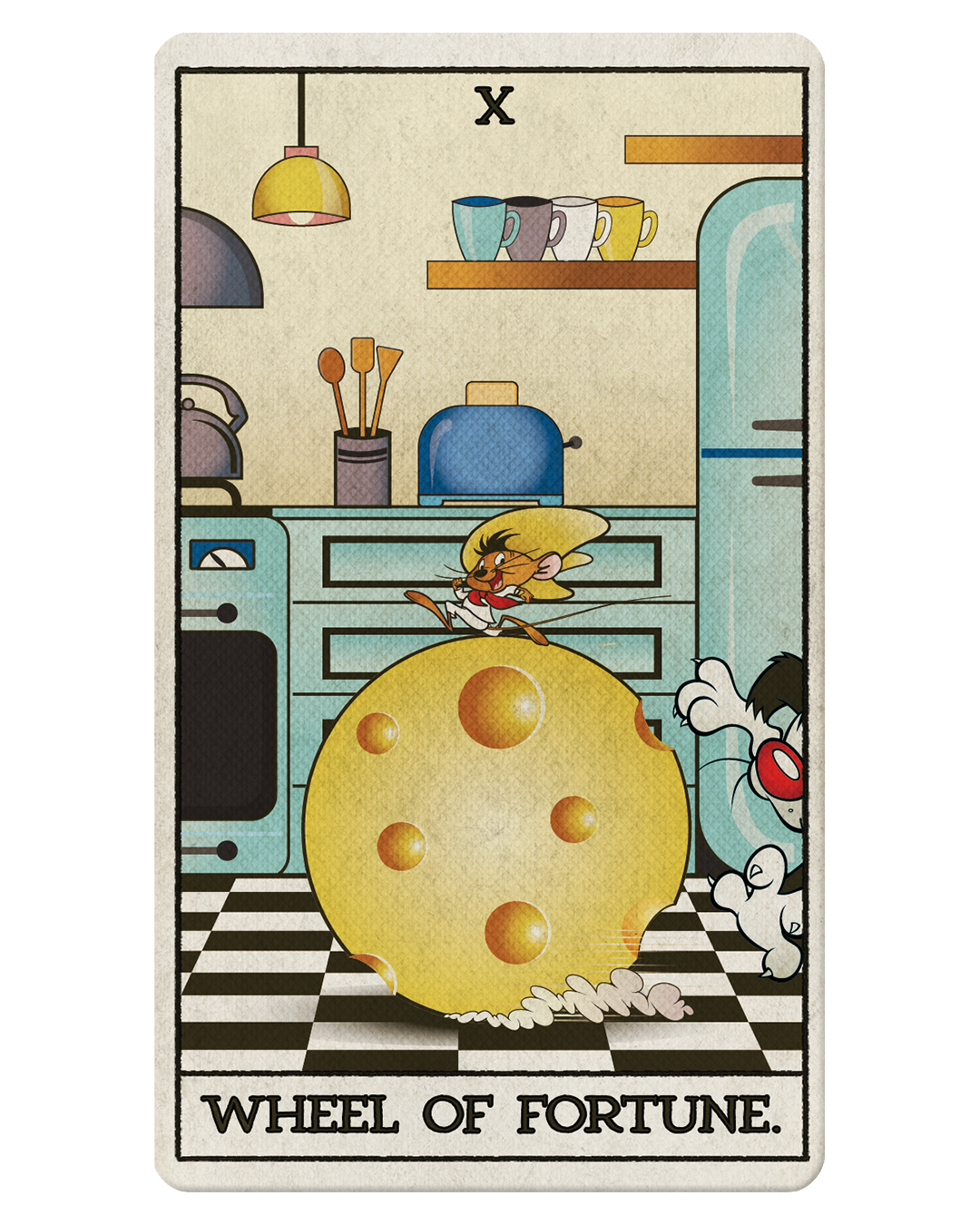
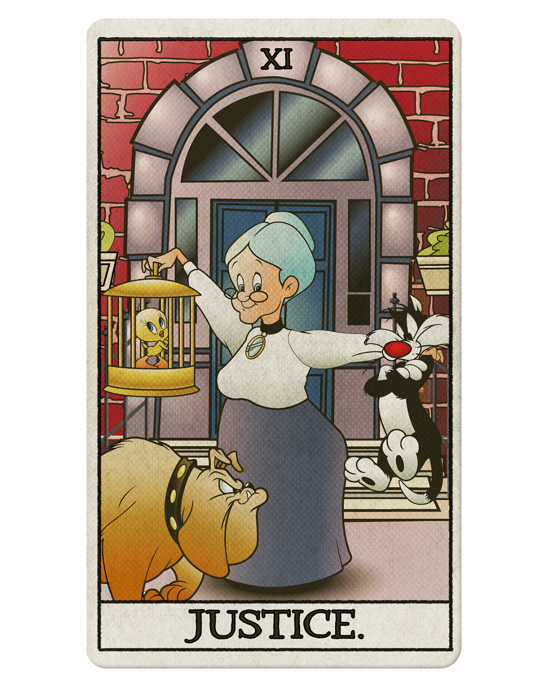
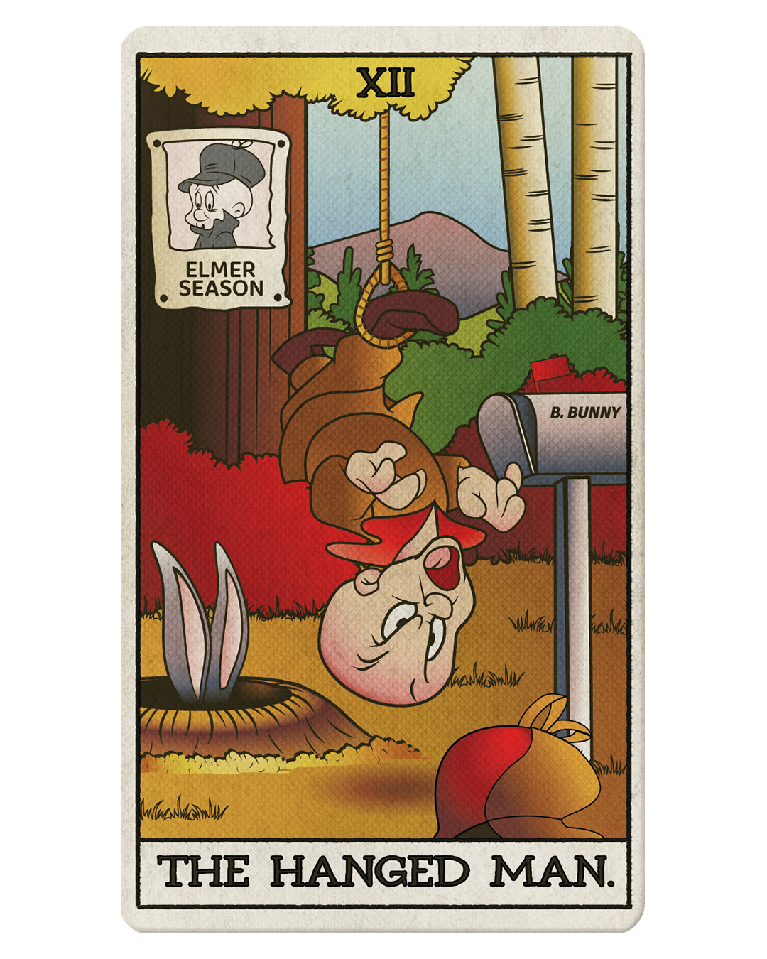
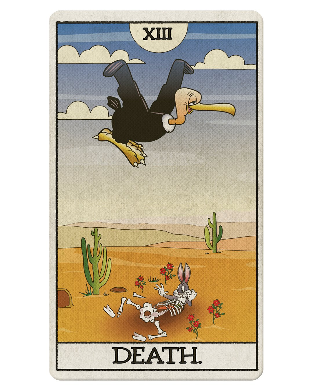
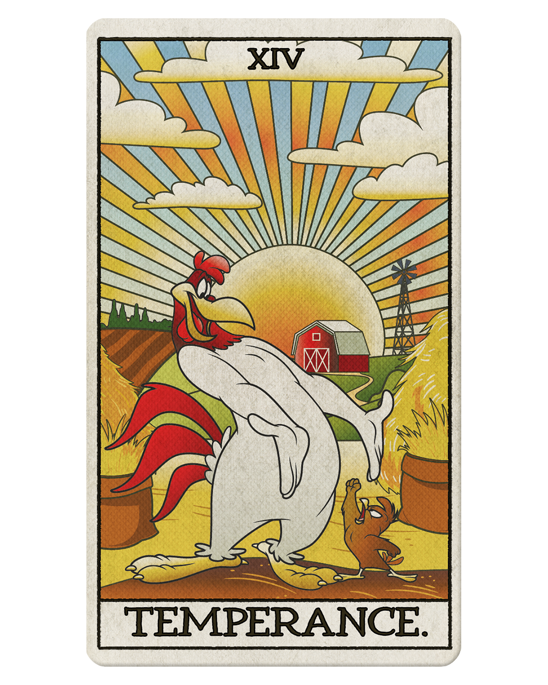
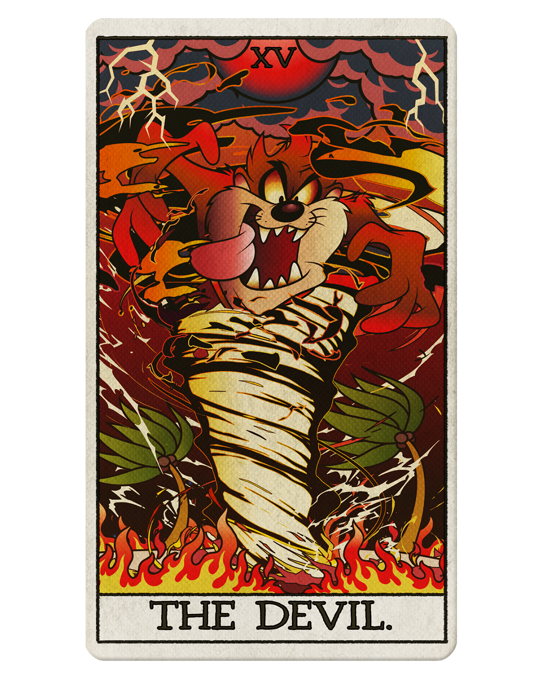
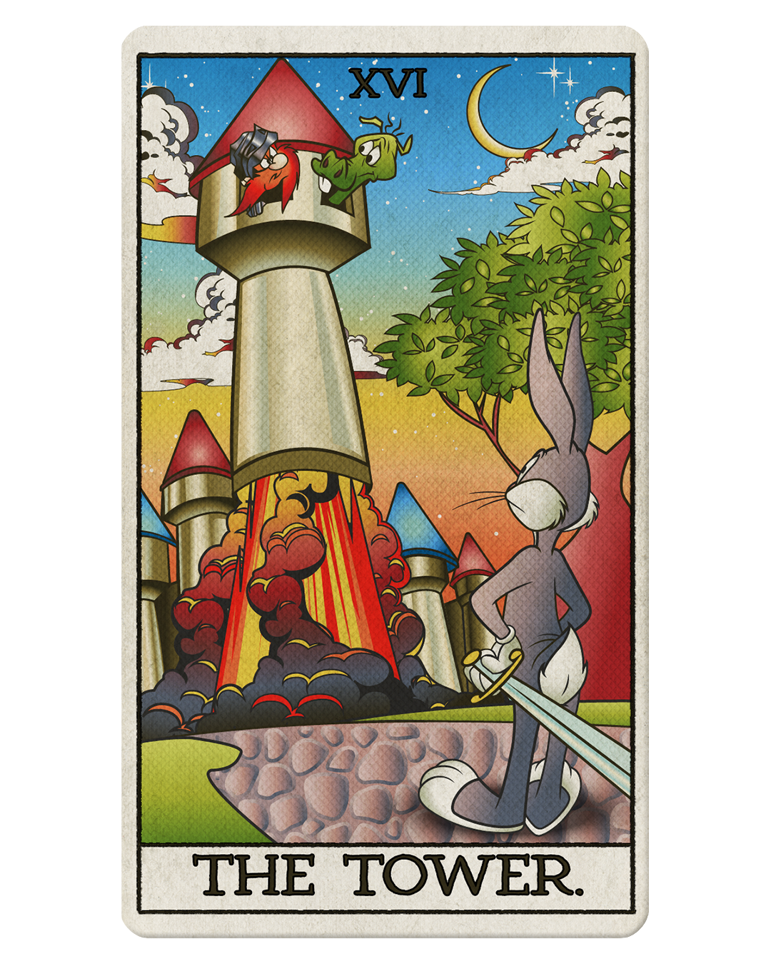
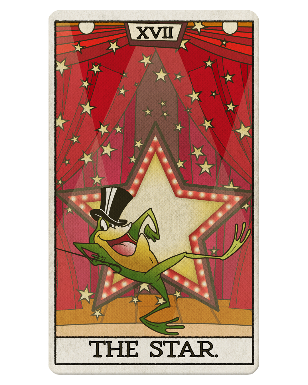
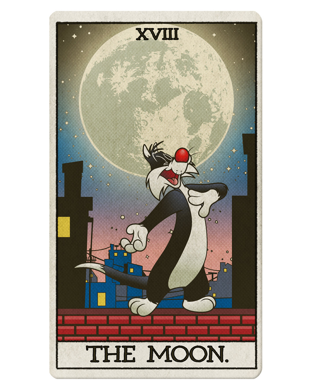
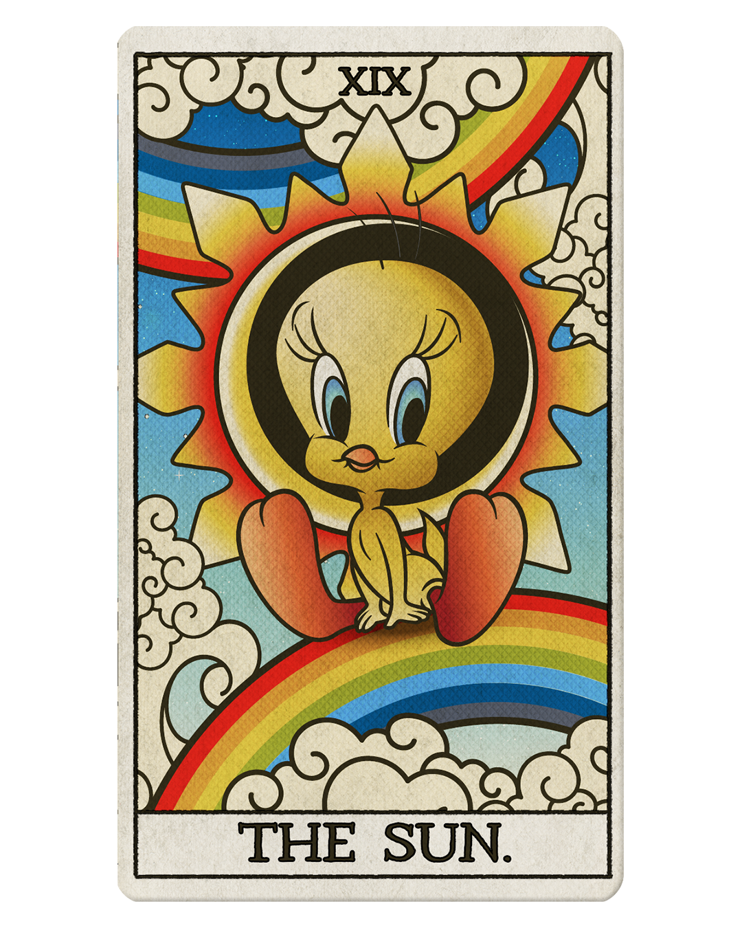
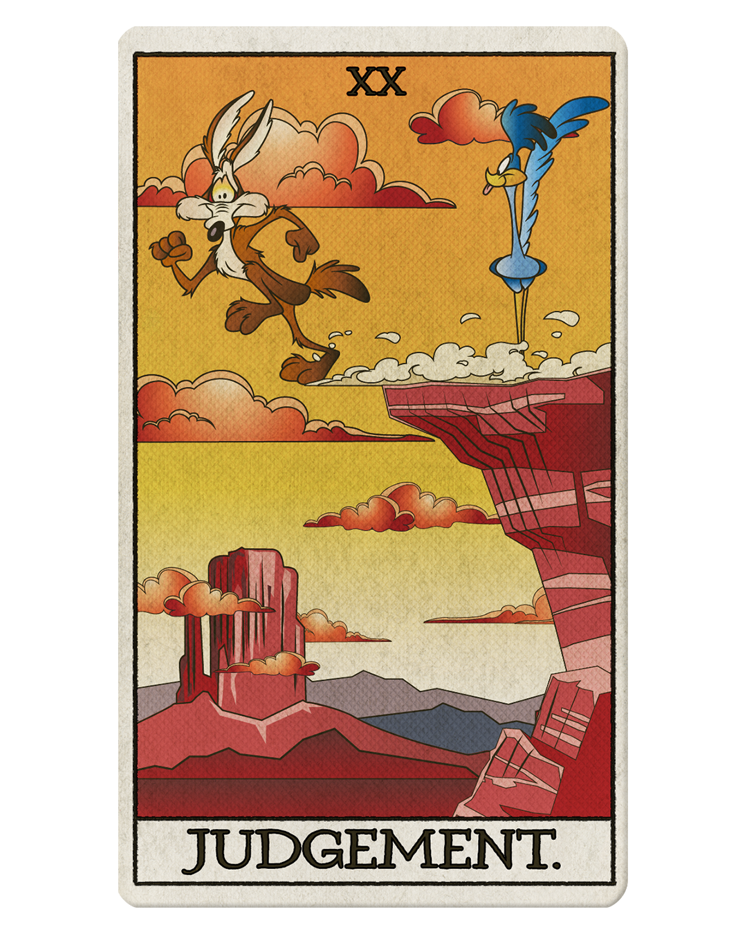
LOONEY TUNES TAROT CARDS
(MAJOR ARCANA)
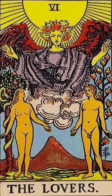
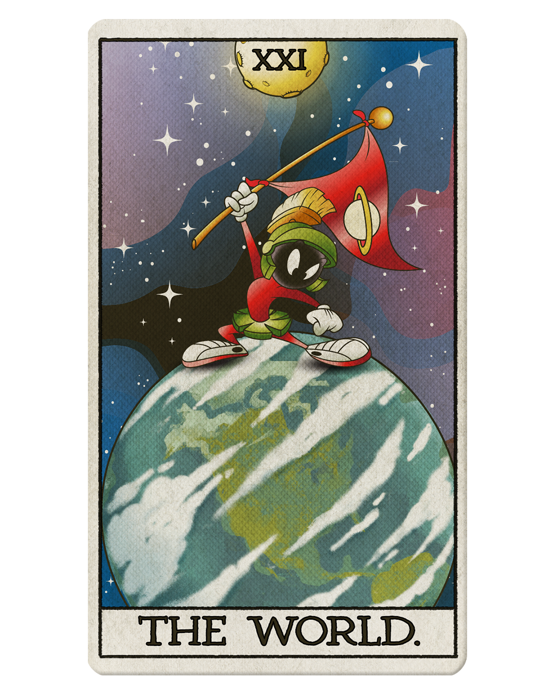
A fun side project, I had the opportunity to create a playful series of Tarot cards inspired by the Looney Tunes mythology. By studying the classic Rider–Waite designs, I translated those compositions and fused them with references to beloved Warner Bros. cartoon characters, matching each character’s personality to the traditional tropes of the cards. Calling it work would be an exaggeration; it was a light, creative exercise meant to give fans a whimsical nod toward the imagery they love. The biggest challenge was fitting all the characters in while leaving room for more, and with a bit of luck and time I hope to finish the entire deck someday.
DESIGN PROCESS
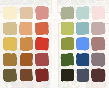
Color Scheme
(Based on Rider-Waite Tarot Color Theme)
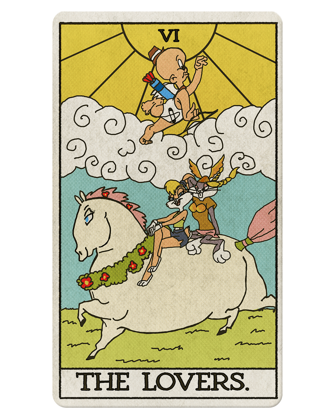
Concept➟
Reference ➟
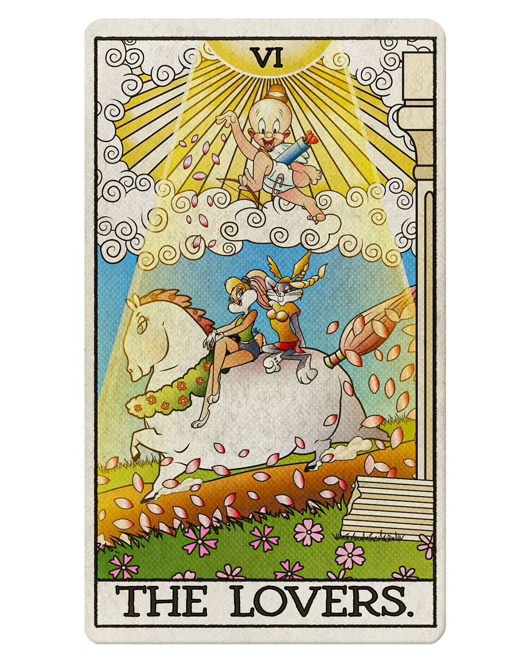
Final✓
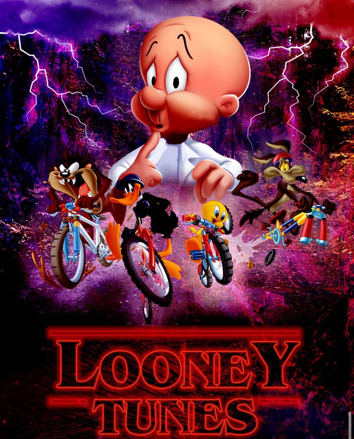
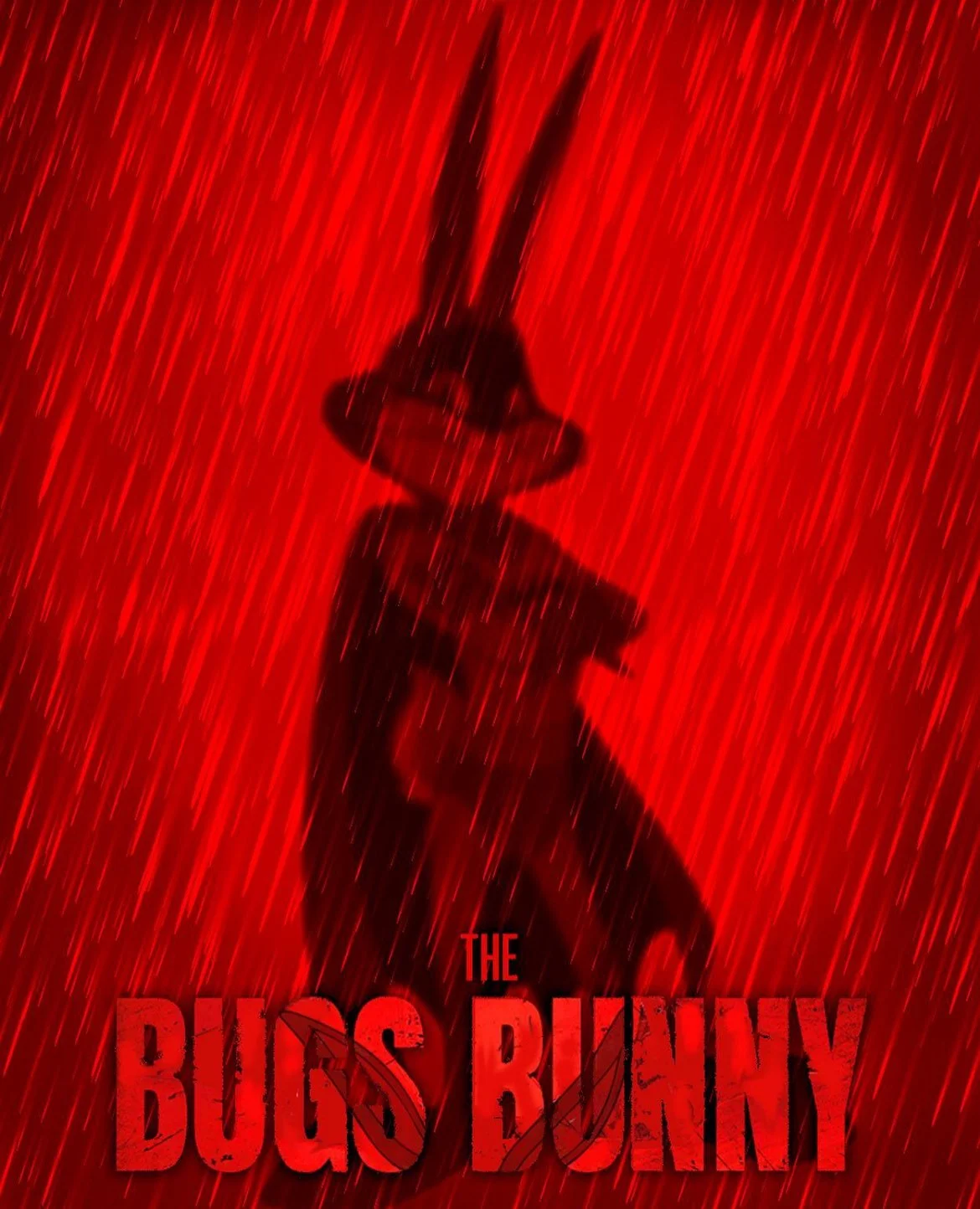
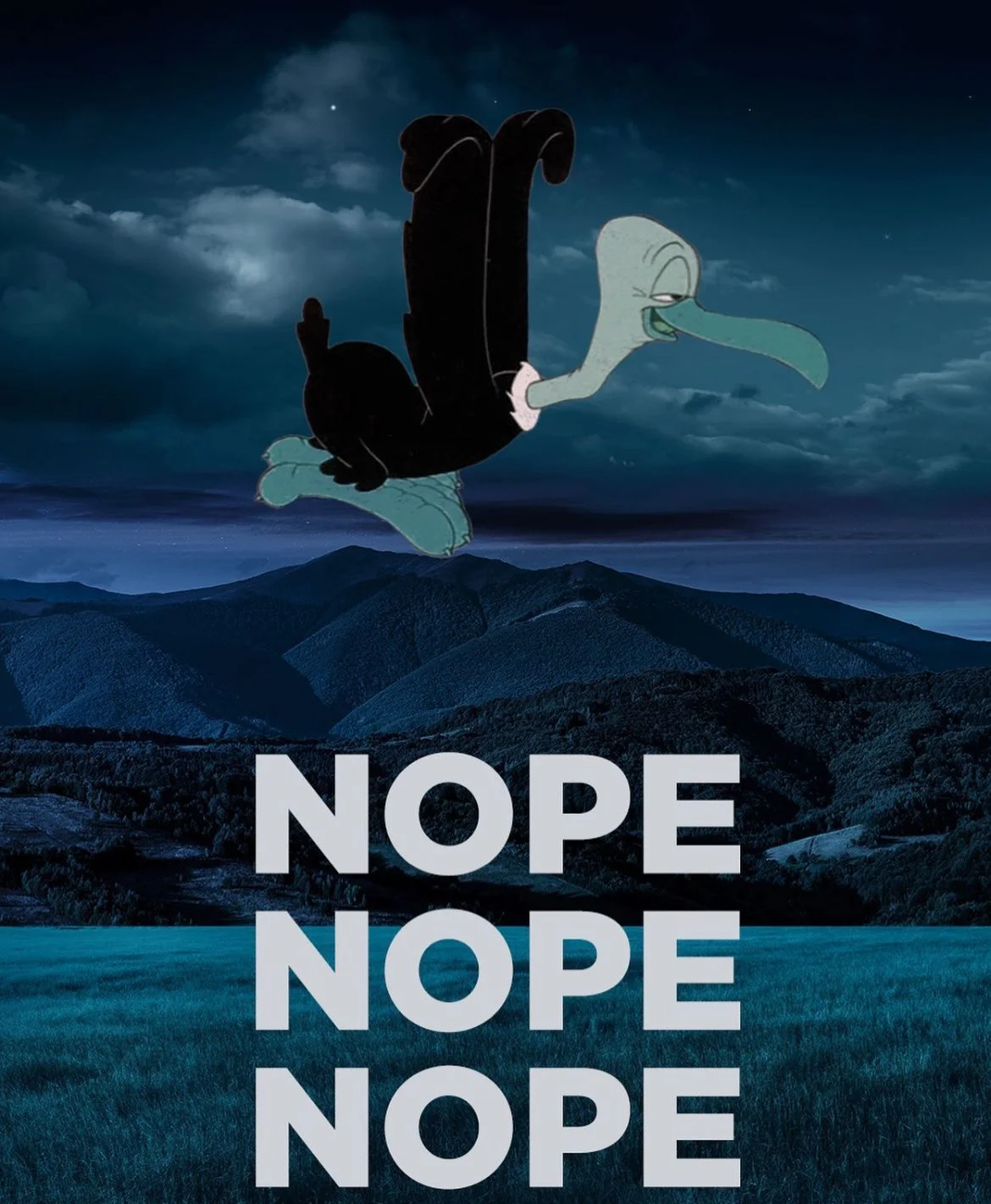
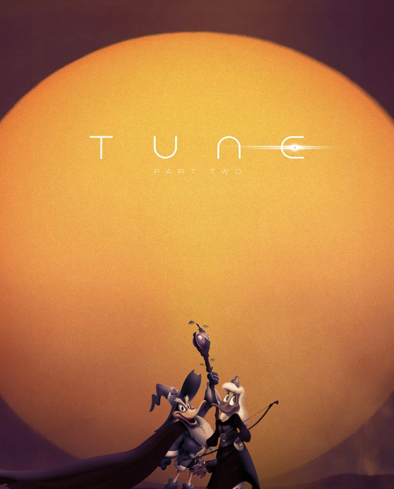
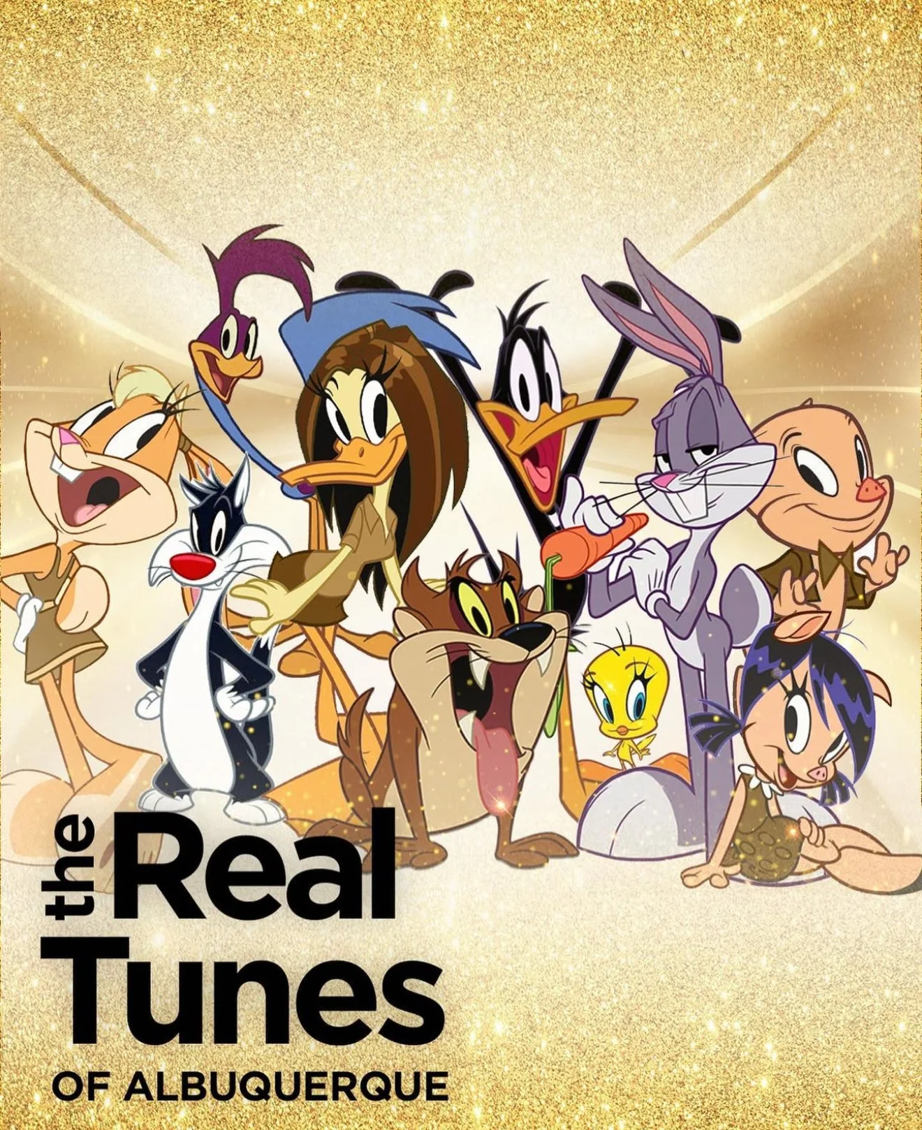
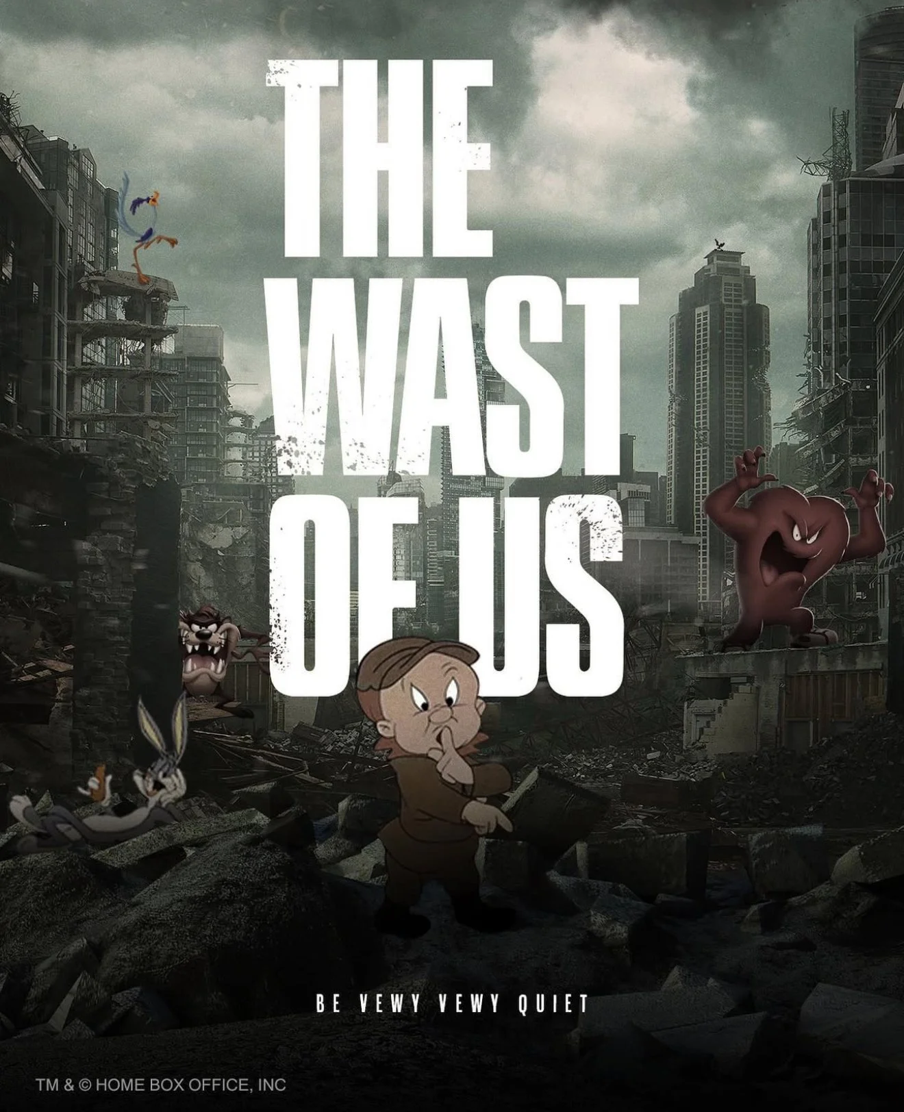
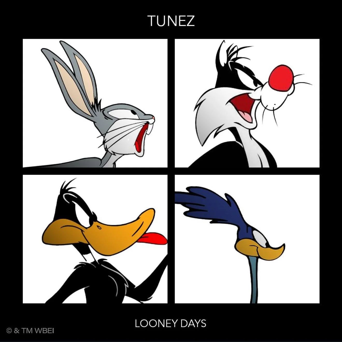
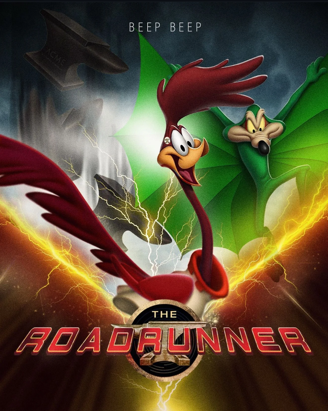
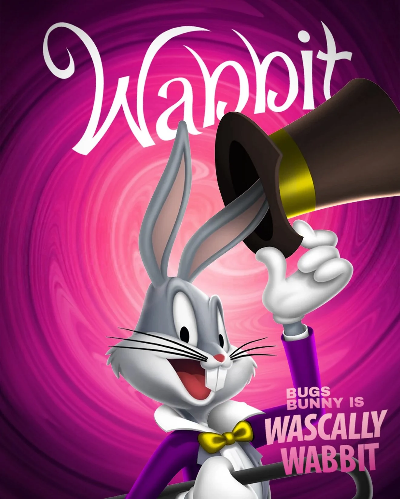
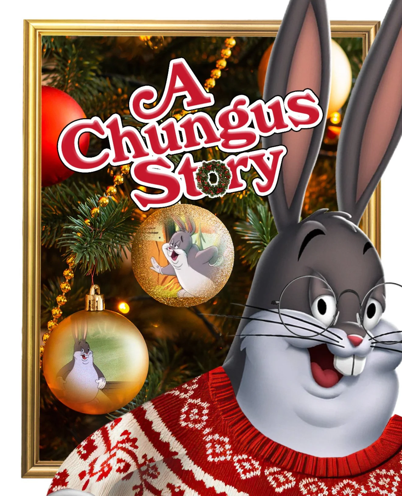
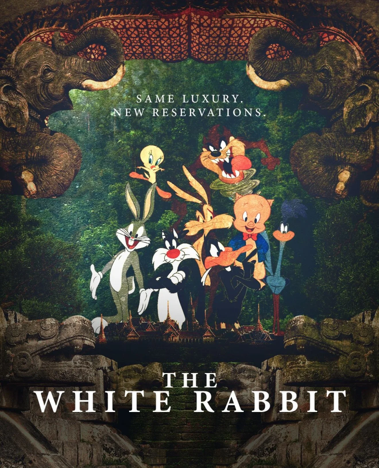
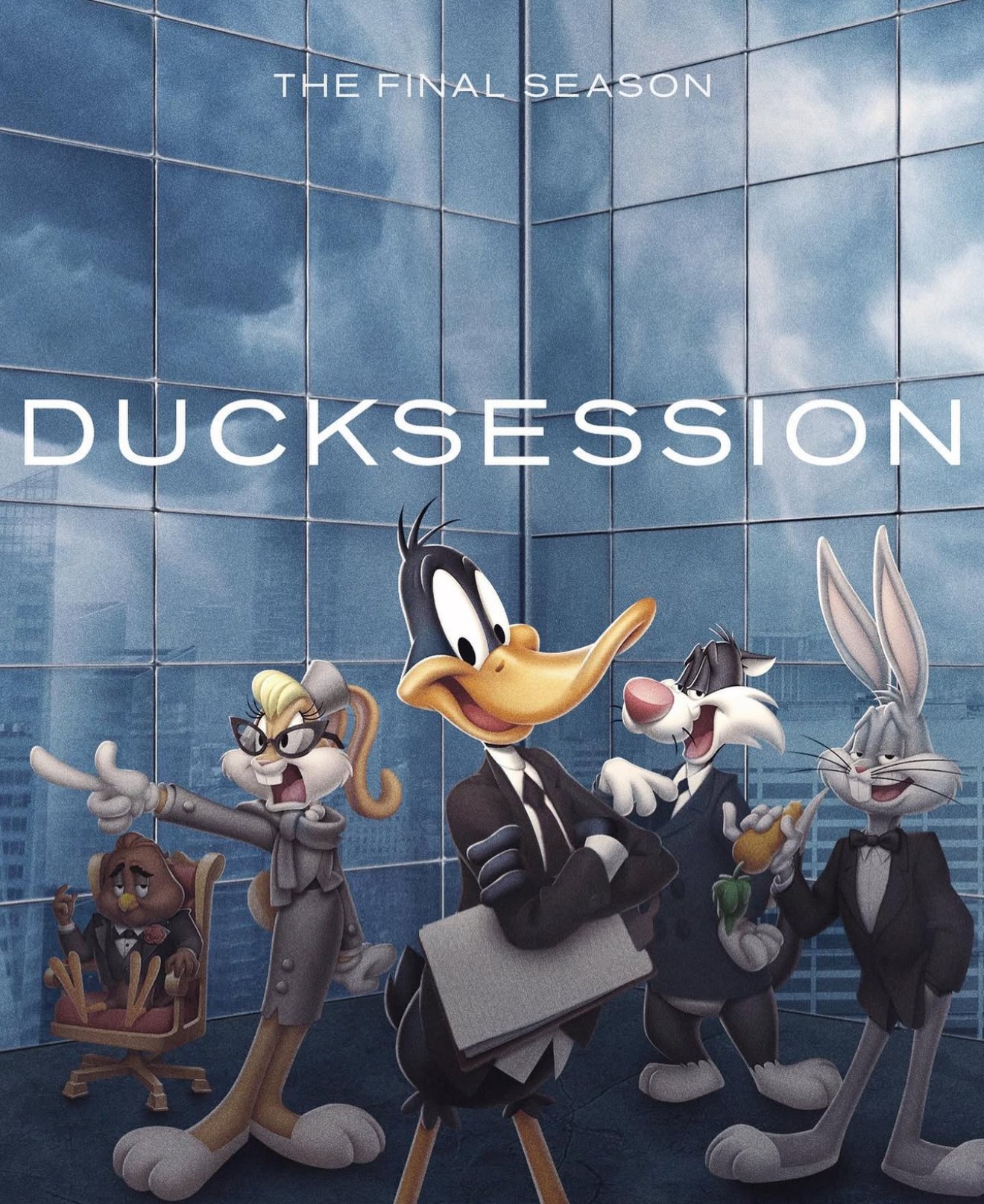
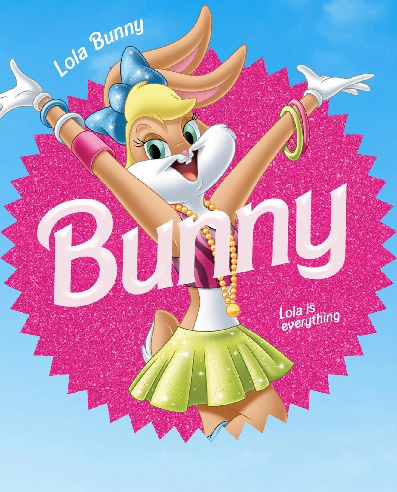
PARODY POSTERS
Our team would design a parody poster fuse the Tunes and whatever premiere
was happening that week. The results were always looney and successful!
Graphic Designer: Patrick Adley and Maricella Guzman
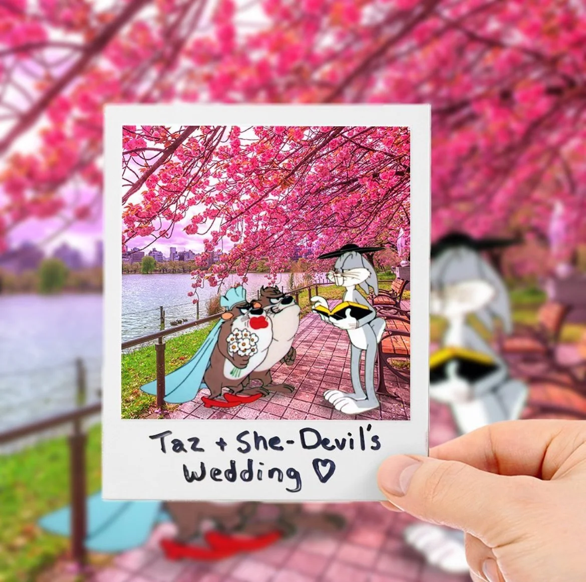
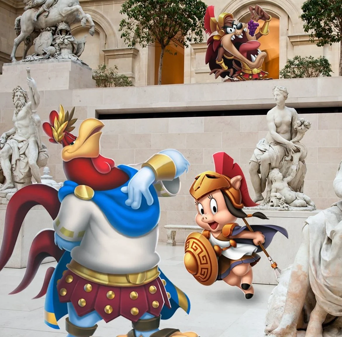
STATIC POSTS
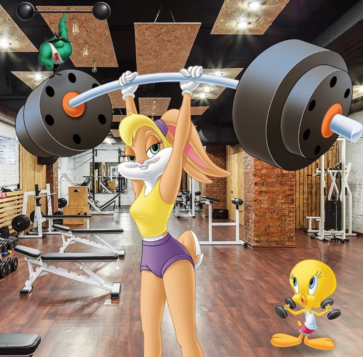
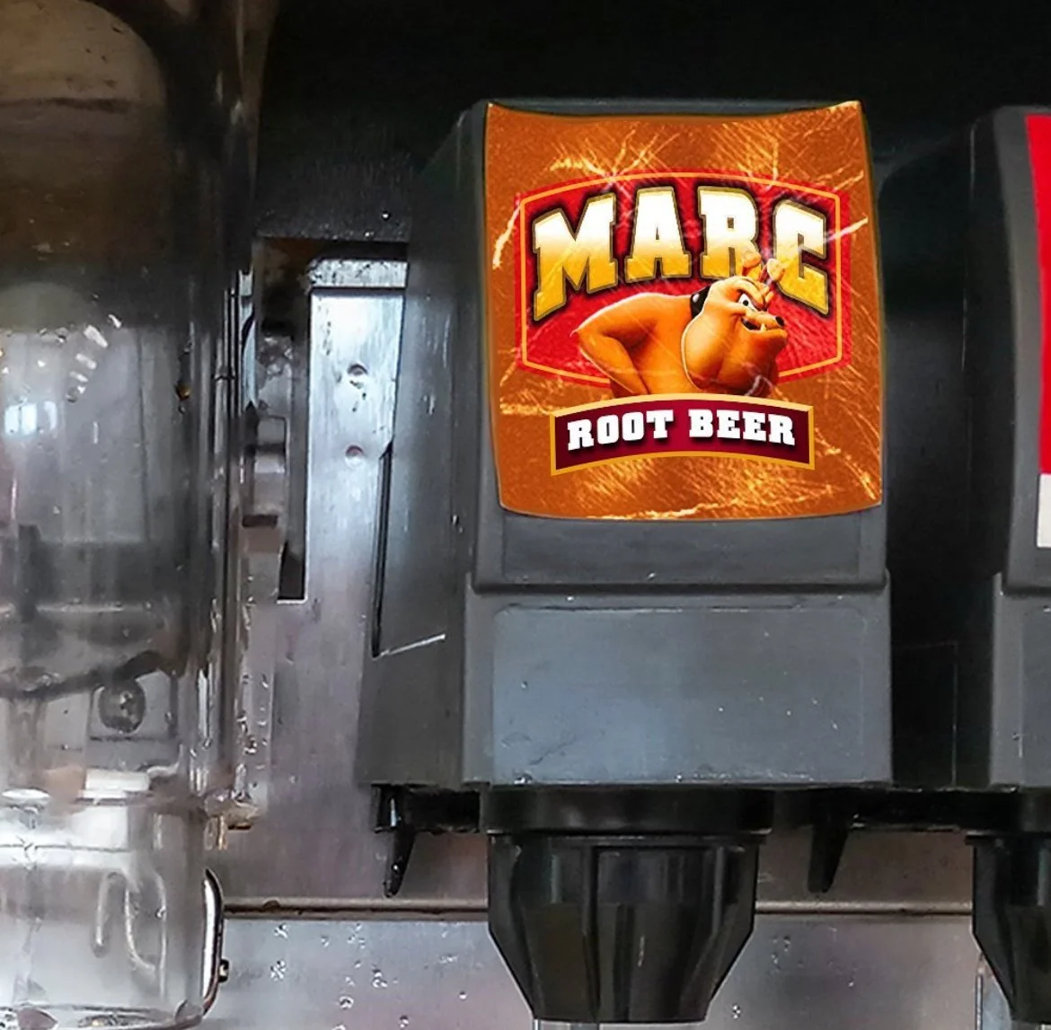
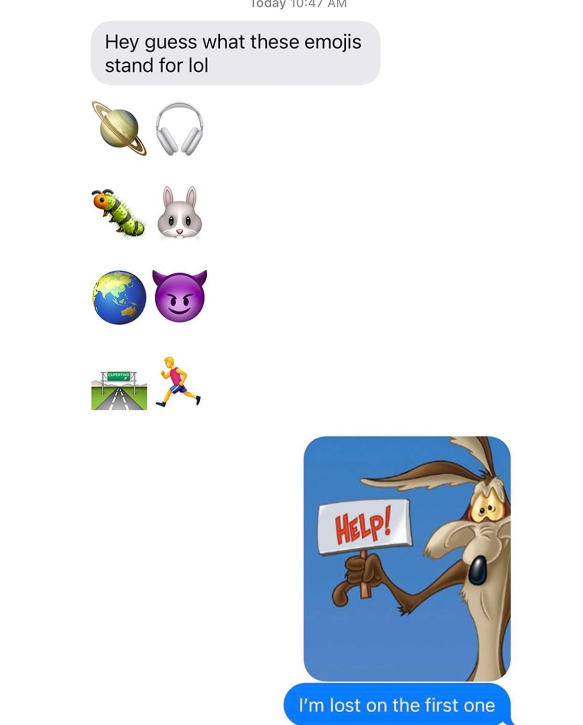
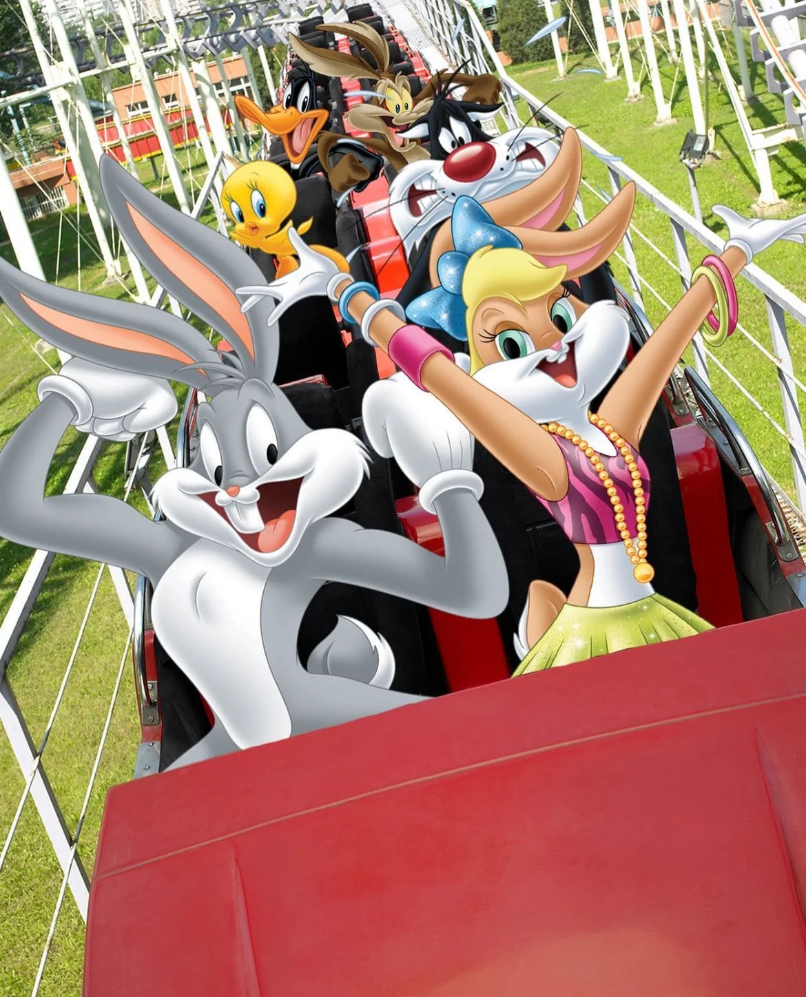
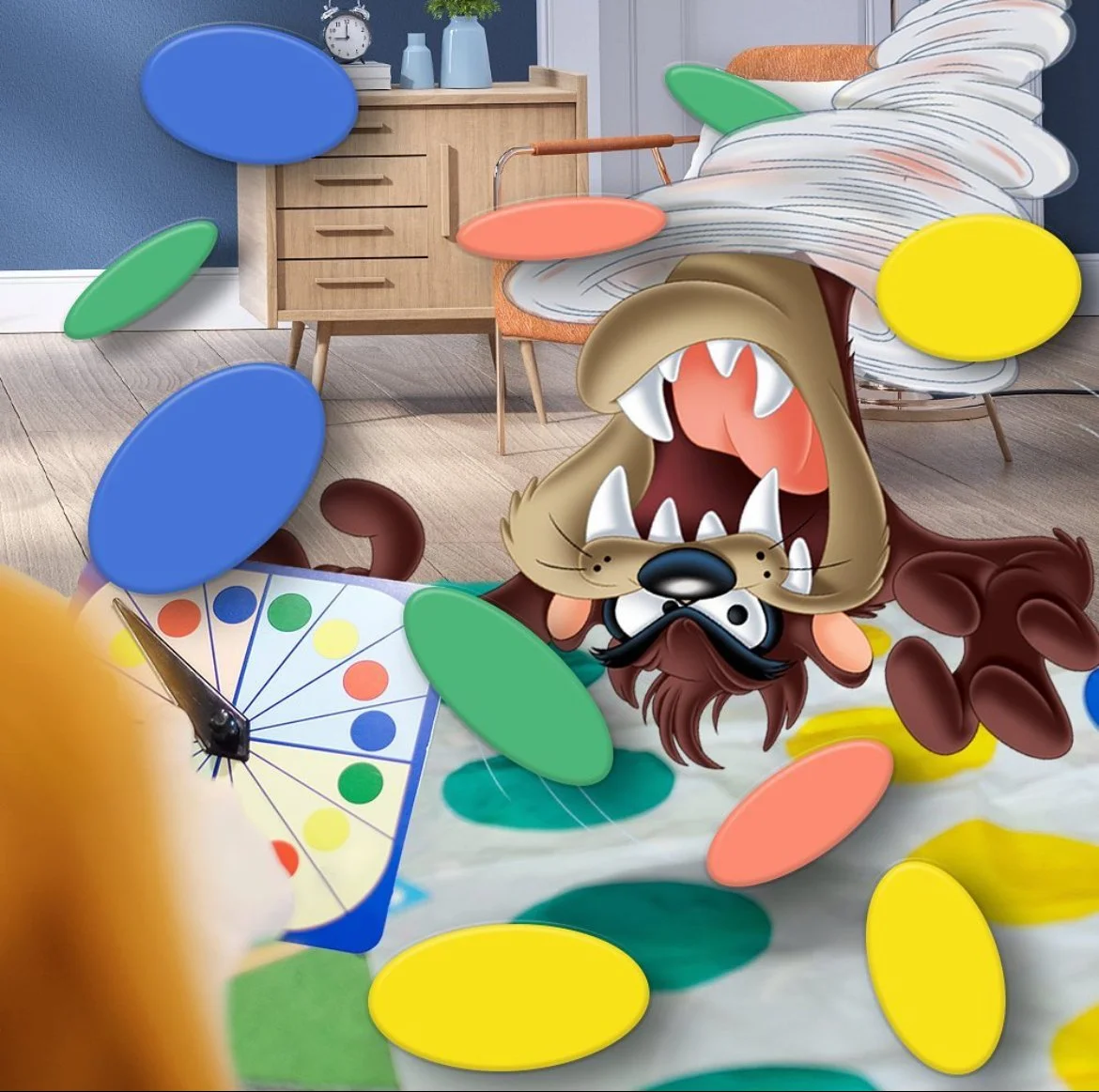
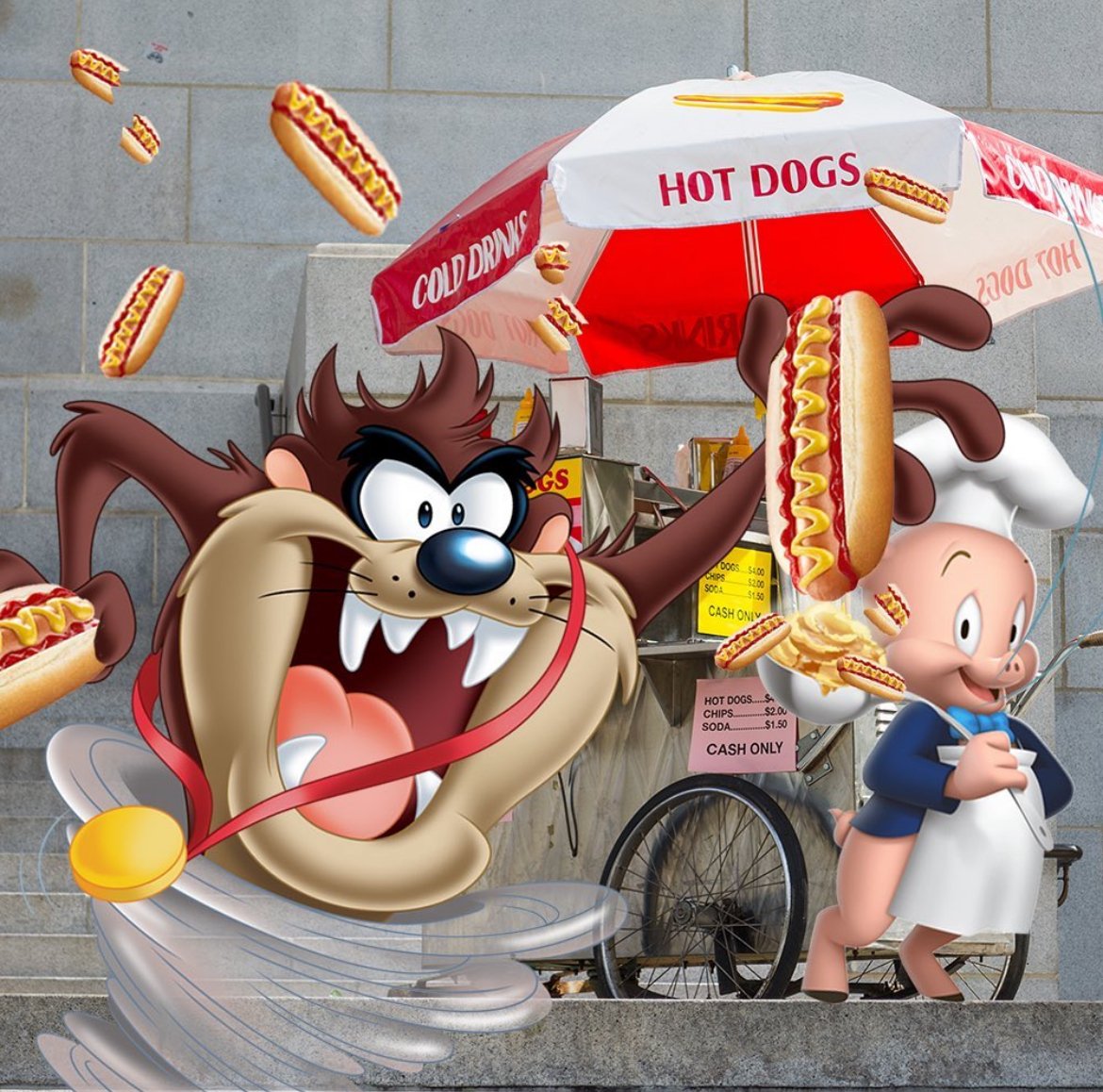
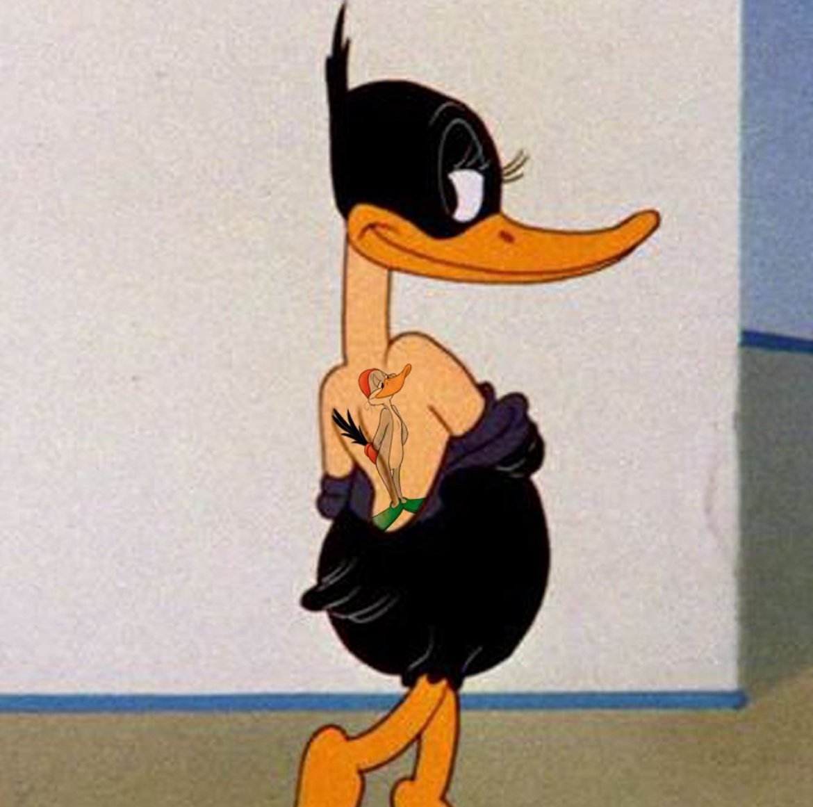
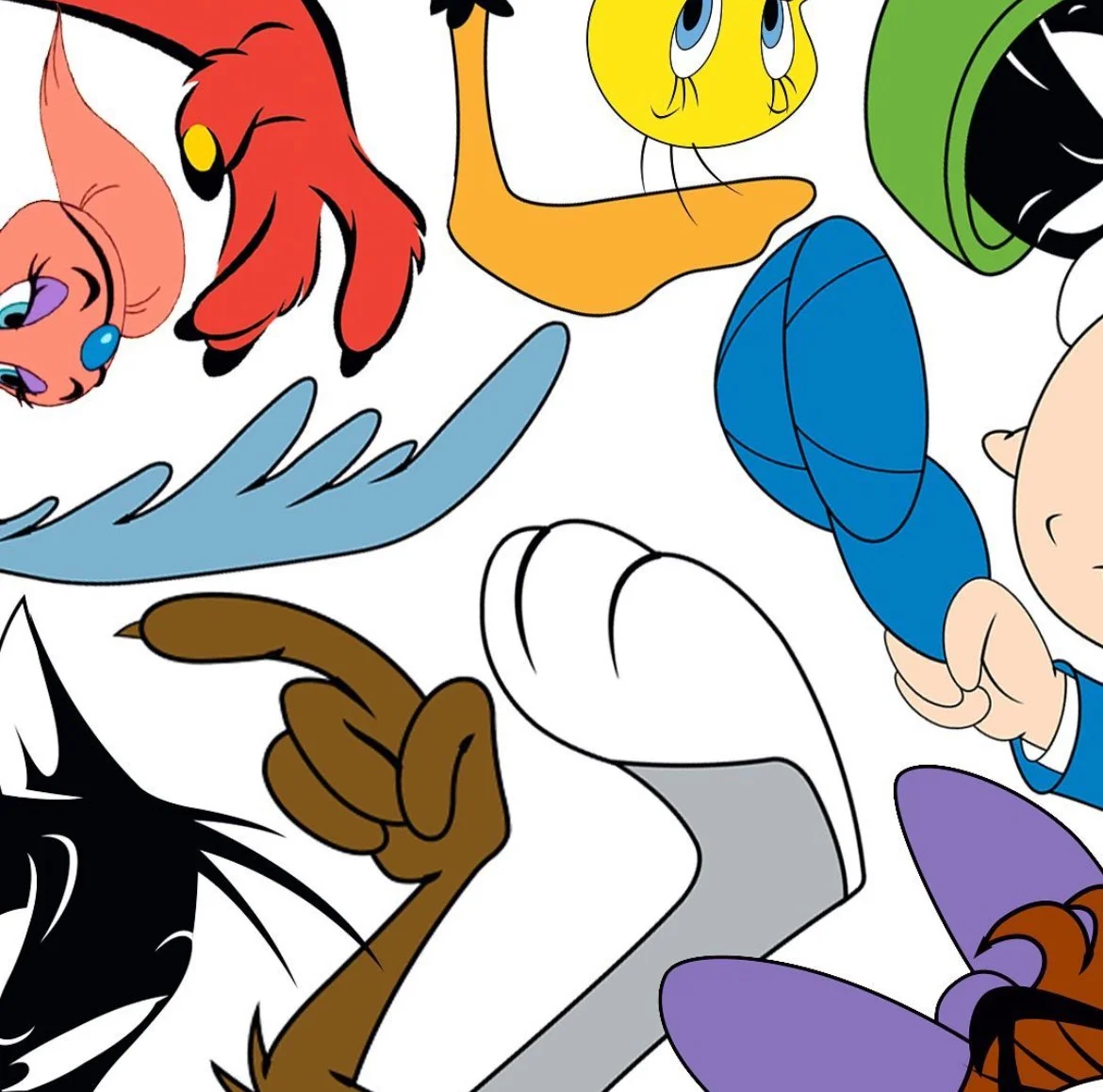
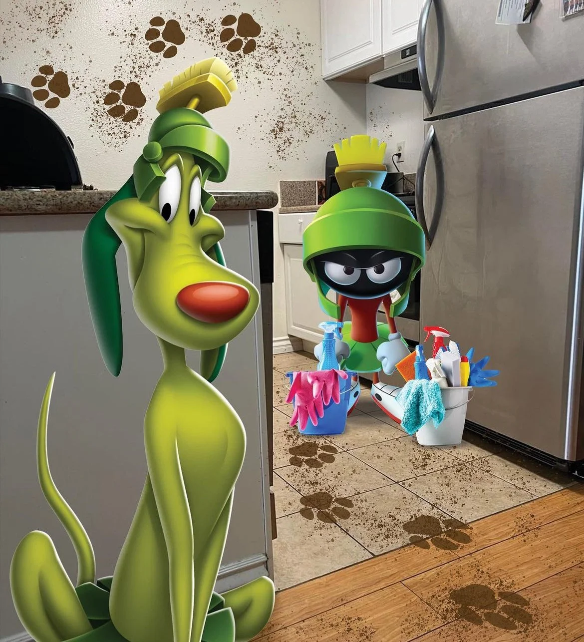
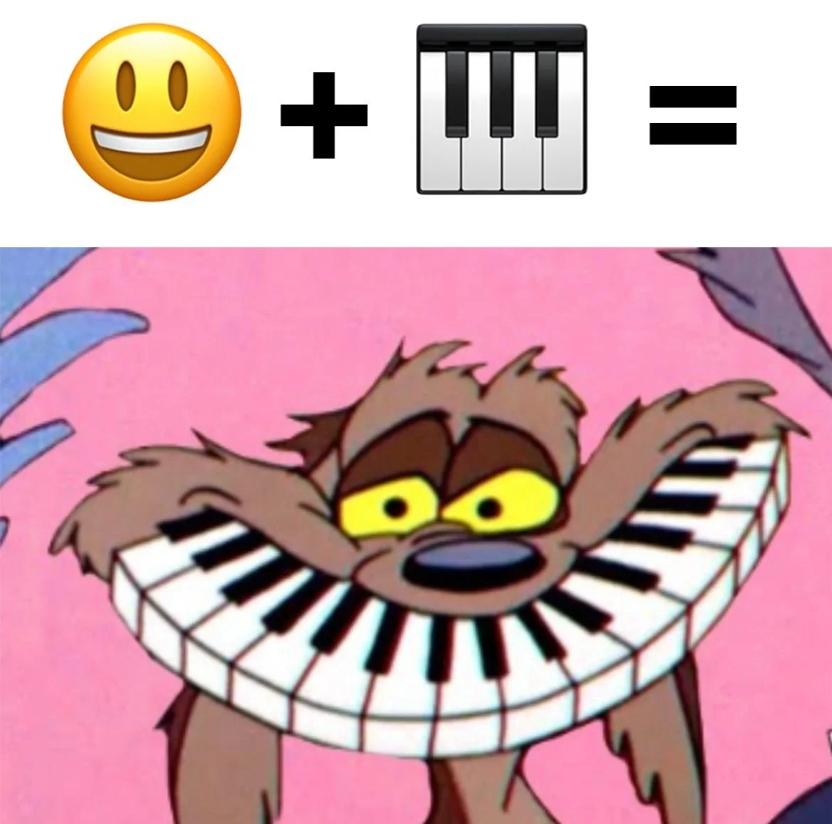
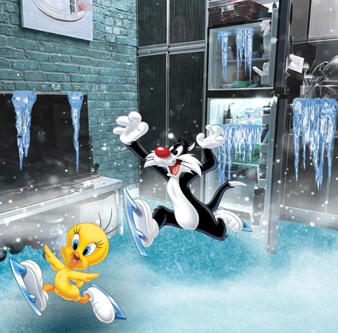
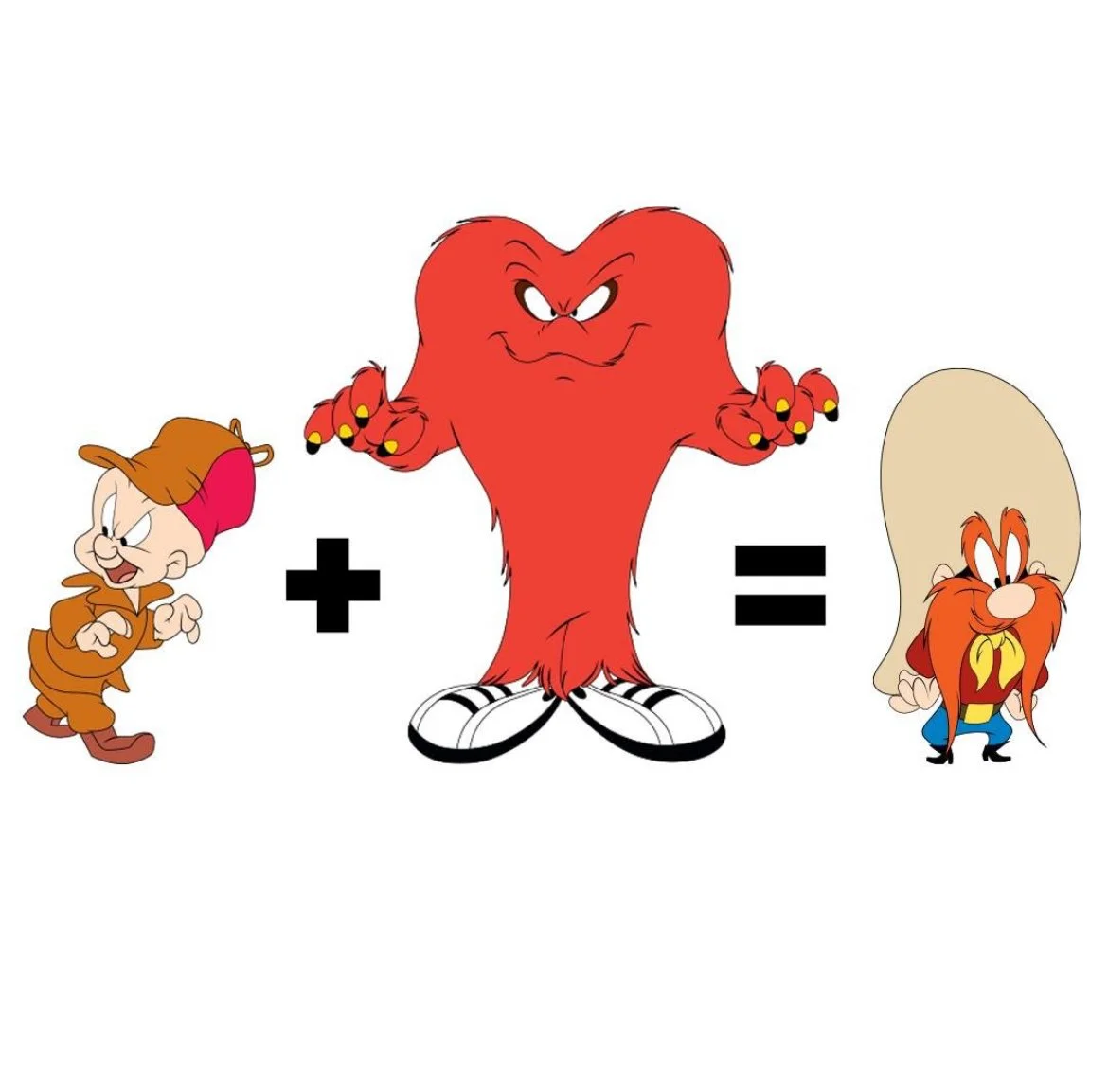
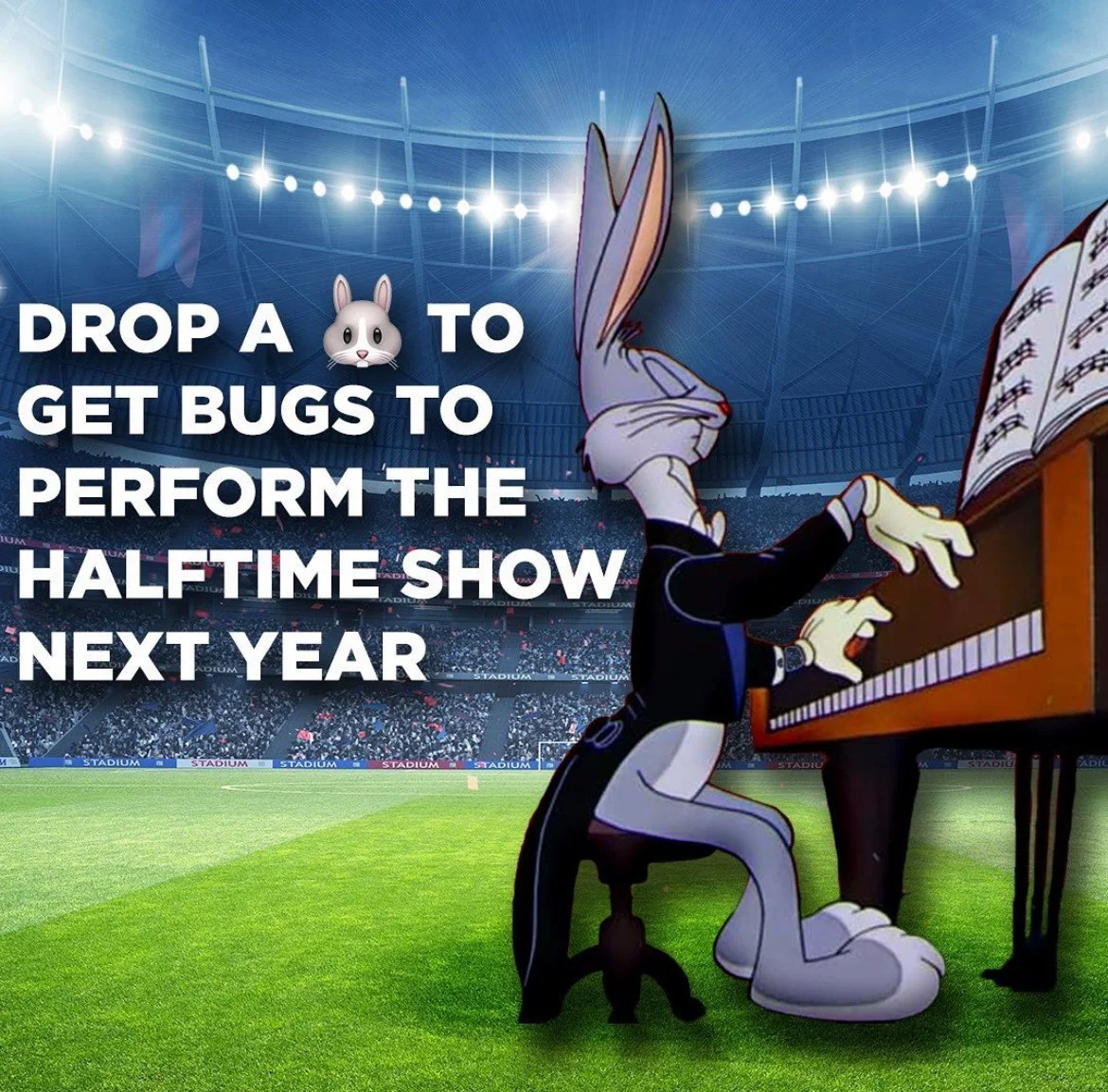
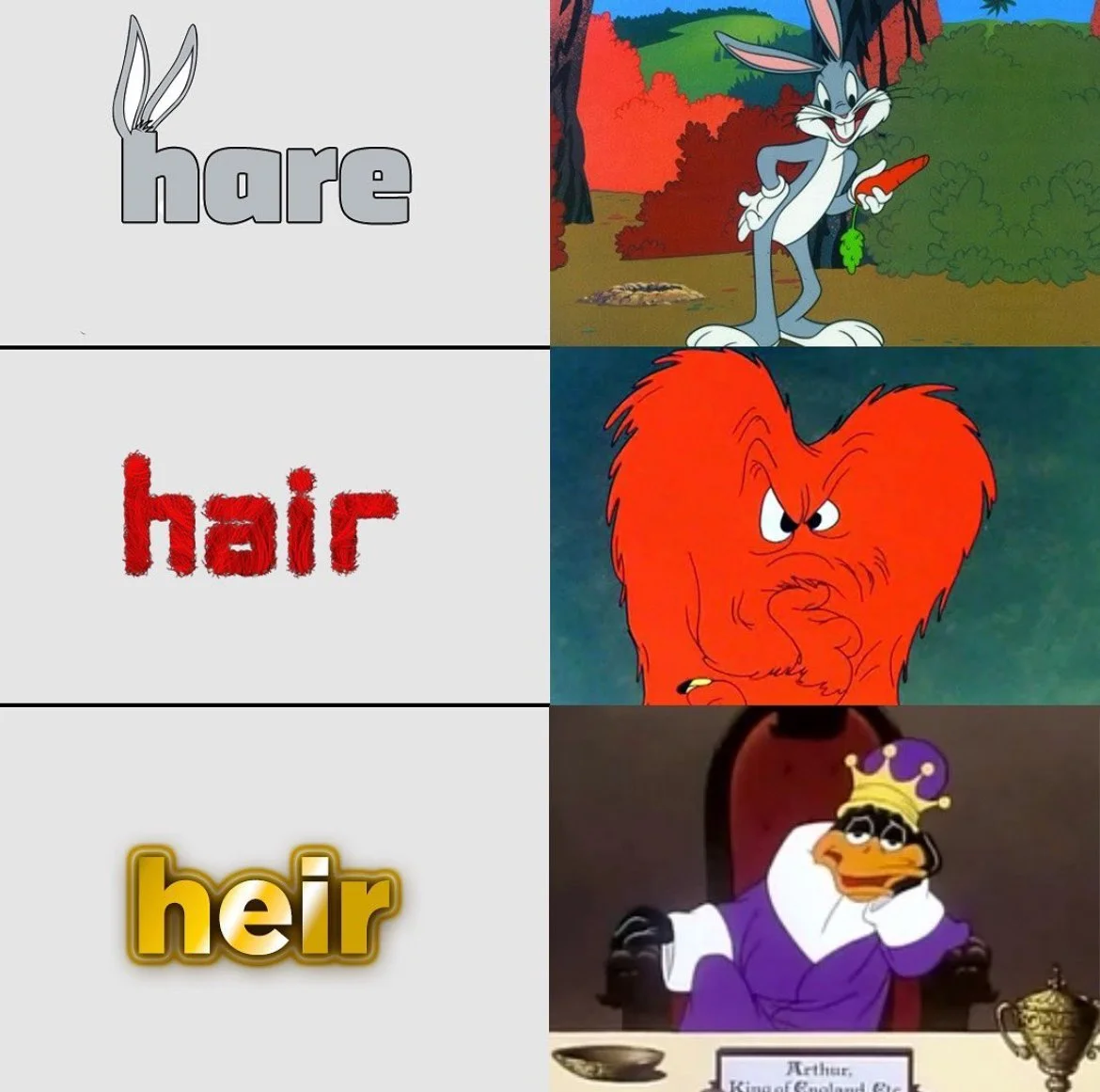
MEMES & GAMES & CLIPS, OH MY!
MEET THE TEAM
Roland Parker
Associate Creative Director
Tyne Oberlander
Senior Copywriter
Patrick Adley
Art Director
Cella Guzman
Designer
Jake Moody
Content Strategist
Sora Lee
Senior Data Strategist
Diana Jannuzzi
Senior Strategy Director
Kemy Acacia
Account Director
Giang Luc
Associate Director, Project Manager
Jordan Kreisberg
Project Manager